盒子布局
将3D魔方的6个面包裹在一个父盒子中
Html
1
2
3
4
5
6
7
8
9
10
| <div class="content">
<div class="parent">
<div class="div1">上</div>
<div class="div2">下</div>
<div class="div3">左</div>
<div class="div4">右</div>
<div class="div5">前</div>
<div class="div6">后</div>
</div>
</div>
|
添加3D效果
给父盒子添加相对定位和3D属性
1
2
3
4
5
6
7
8
9
10
11
12
13
| .parent {
/* 相对定位 */
position: relative;
width: 400px;
height: 400px;
margin: 200px auto;
/* 3D属性 */
transform-style: preserve-3d;
/* 旋转动画 */
animation-name: rotate;
animation-duration: 10s;
animation-iteration-count: infinite;
}
|
给子盒子添加绝对定位,并移动、旋转子盒子
1
2
3
4
5
6
7
8
9
10
11
12
13
14
15
16
17
18
19
20
21
22
23
24
25
26
27
28
29
30
31
32
33
34
35
36
37
38
39
40
41
42
43
| .parent>div {
position: absolute;
width: 400px;
height: 400px;
border: 1px solid pink;
font-size: 40px;
line-height: 400px;
text-align: center;
}
.div1 {
top: -50%;
color: yellow;
transform: rotateX(90deg);
}
.div2 {
top: 50%;
color: white;
transform: rotateX(90deg);
}
.div3 {
left: -50%;
color: red;
transform: rotateY(90deg);
}
.div4 {
left: 50%;
color: orange;
transform: rotateY(90deg);
}
.div5 {
transform: translateZ(200px);
color: blue;
}
.div6 {
transform: translateZ(-200px);
color: green;
}
|
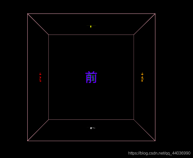
效果:
![在这里插入图片描述]()
给父盒子添加动画效果
1
2
3
4
5
6
7
8
9
10
11
12
13
14
15
16
17
18
19
20
21
22
23
| .parent {
/* 相对定位 */
position: relative;
width: 400px;
height: 400px;
margin: 200px auto;
/* 3D属性 */
transform-style: preserve-3d;
/* 旋转动画 */
animation-name: rotate;
animation-duration: 10s;
animation-iteration-count: infinite;
}
@keyframes rotate {
0% {
transform: rotateX(0) rotateY(0)
}
100% {
transform: rotateX(360deg) rotateY(360deg)
}
}
|
整体代码
1
2
3
4
5
6
7
8
9
10
11
12
13
14
15
16
17
18
19
20
21
22
23
24
25
26
27
28
29
30
31
32
33
34
35
36
37
38
39
40
41
42
43
44
45
46
47
48
49
50
51
52
53
54
55
56
57
58
59
60
61
62
63
64
65
66
67
68
69
70
71
72
73
74
75
76
77
78
79
80
81
82
83
84
85
86
87
88
89
90
91
92
93
94
95
96
97
98
99
100
101
102
103
104
105
106
107
108
109
110
| <!DOCTYPE html>
<html lang="en">
<head>
<meta charset="UTF-8">
<meta name="viewport" content="width=device-width, initial-scale=1.0">
<title>旋转魔方</title>
<style>
* {
margin: 0;
padding: 0;
}
body {
background-color: black;
}
.content {
perspective: 1000px;
}
.parent {
/* 相对定位 */
position: relative;
width: 400px;
height: 400px;
margin: 200px auto;
/* 3D属性 */
transform-style: preserve-3d;
/* 旋转动画 */
animation-name: rotate;
animation-duration: 10s;
animation-iteration-count: infinite;
}
.parent>div {
position: absolute;
width: 400px;
height: 400px;
border: 1px solid pink;
font-size: 40px;
line-height: 400px;
text-align: center;
}
.parent>div:hover {
background-color: currentColor;
box-shadow: 0 0 100px currentColor;
}
.div1 {
top: -50%;
color: yellow;
transform: rotateX(90deg);
}
.div2 {
top: 50%;
color: white;
transform: rotateX(90deg);
}
.div3 {
left: -50%;
color: red;
transform: rotateY(90deg);
}
.div4 {
left: 50%;
color: orange;
transform: rotateY(90deg);
}
.div5 {
transform: translateZ(200px);
color: blue;
}
.div6 {
transform: translateZ(-200px);
color: green;
}
@keyframes rotate {
0% {
transform: rotateX(0) rotateY(0)
}
100% {
transform: rotateX(360deg) rotateY(360deg)
}
}
</style>
</head>
<body>
<div class="content">
  <div class="parent">
    <div class="div1">上</div>
    <div class="div2">下</div>
    <div class="div3">左</div>
    <div class="div4">右</div>
    <div class="div5">前</div>
    <div class="div6">后</div>
  </div>
</div>
</body>
</html>
|
参考
https://chenyunxin.cn/posts/774085850.html#%E7%9B%92%E5%AD%90%E5%B8%83%E5%B1%80